Do you think about those questions? How about these ones:
How long does it take to get a software change reviewed? Do you know? Is it important to your business? Is it a bottleneck? Do reviews get skipped during busy periods?If you care about code reviews, you should measure them. Put them on your system dashboard. They’re as much an indicator of the health of your software environment as your API response times. Minimising Work In Progress and Mean-Time-To-Release are important parts of your QA process, and making sure your pull requests are reviewed and merged in a timely fashion is a great way to improve those numbers.
What existing products are there out there to do this? Depending on the tools you use, you can probably pull out a few relevant reports. Jira is popular, and I’ve seen PMs produce some great graphs to include in their monthly management update. The problem is, the numbers you get out of these tools don’t give you direct, real-time feedback. Their very nature as longer-term averages mean they can’t represent a call to action.
Enter TeamLab
As a software shop, if the tools I’m using don’t do what I want, I have an option: build something. This is a dangerous option to have, and countless business hours have been wasted solving the wrong problems, but I really needed a nice visual prompt of how we’re doing at our code reviews in-the-moment. I also wanted a side-project for the team to tinker with new ideas for writing web applications – so even if the project didn’t turn out to be useful, the experiment would teach us something.
I had a specific technology I wanted to try out: React Storybook. This is a really nice way to visualise your React components in various different states, and I wanted something relevant to use as a demo for the team. It was very quick and easy to get up and running with a create-react-app project including Storybook, and I hacked together a quick picture of what my PR display should look like:

On the right, you can see my quick mock-up of a board displaying ten pull requests, and the left is the Storybook control panel.
I decided it would be useful to colour-code the pull requests, and display any reviewers and approvers on the PR cards. A new PR is yellow, and an approved one is green. A PR with reviewers turns blue, and most importantly, any PR which is older than 48 hours turns red.

This was a nice little mock-up, but there was no real data behind it at this stage. Fortunately, the Git server we use has a fairly straightforward API, and so it didn’t take long to get some real data behind this component.

It’s really easy to see when we have PRs which are starting to get stale, and need attention. Quick – at a glance, how many PRs here have been hanging around too long and need attention?

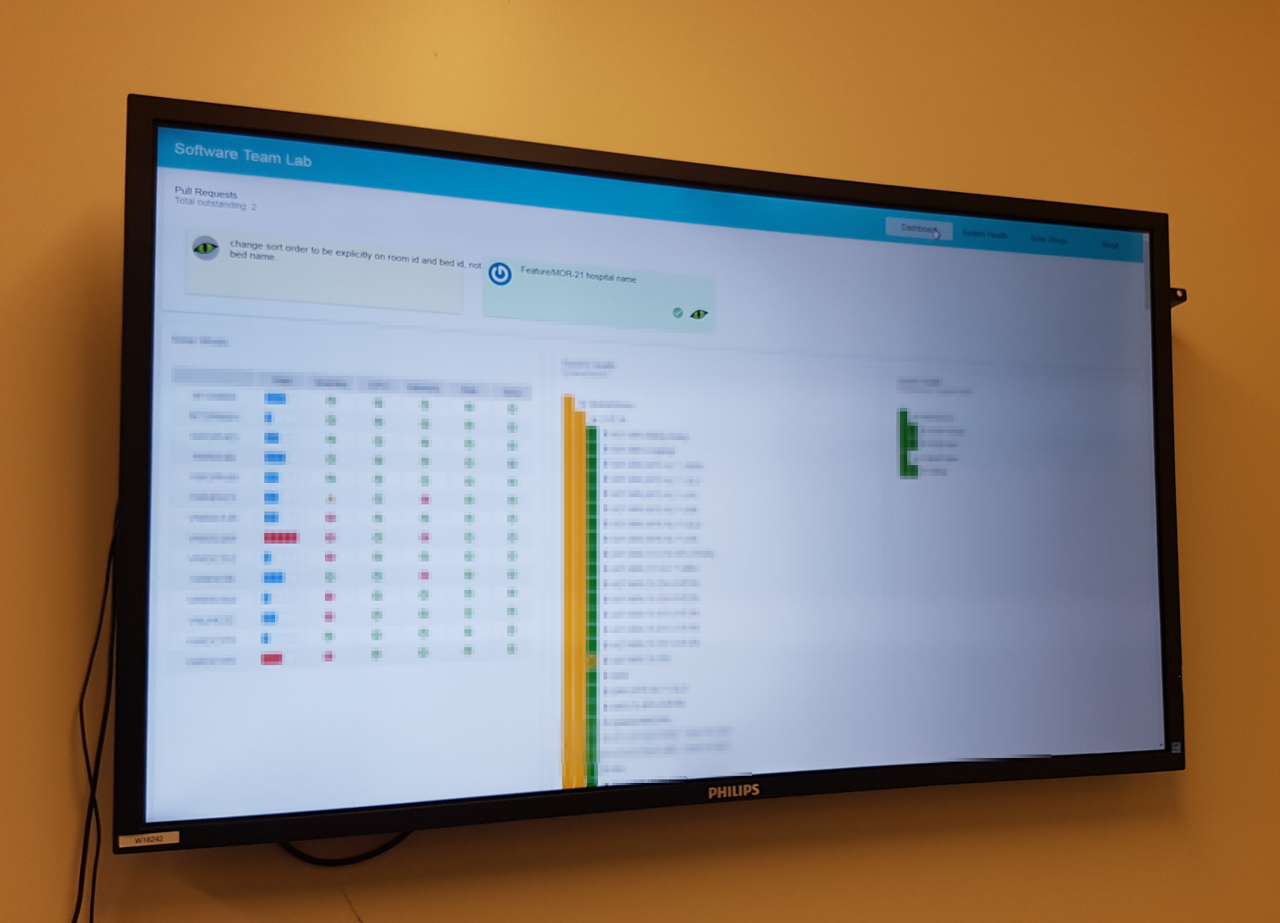
This has become the go-to way of seeing our outstanding PRs at a glance, and has since gone up on a big screen on the wall in our dev team office. I soon got requests for a few other widgets to go on the same dashboard, and our little side project has become a key part of our DevOps toolkit.

Has It Worked?
Having those cards up where we can see them during the day has been good – but the biggest signal is during stand-up each morning. A quick glance at the TeamLab PR board has become part of the ritual, and if those cards start to build up – especially if they start to turn red – the team has a really strong signal that we’re getting behind on our code reviews.
I don’t currently have a report which tells me the Mean-Time-To-Merge for our PRs – but I don’t think I need it. Mean-Time-To-Merge isn’t as strong or immediate a signal as a pile of glaring red PR cards looming over our morning stand-up, nor does it provide the immediate sense of relief when we clear the board.
What Next?
I’m not sure what will go on the dashboard next, but I have some idea what kinds of things I’m looking for.
I need things I can measure – things I can pull straight out of an API. Things which can directly influence numbers like Mean-Time-To-Release – but I don’t want to display averages like that. I’m going to give people a dial they can turn directly. I’ll pick an angry colour like red for things which are outside targets, and nice friendly colours like blue and green for things which are on track. Once something is off the list, I’ll make it go away.
In short, I want to find things which I can measure, which team members can directly influence, and which will improve our overall quality – and I want to put them up where everyone can see them.